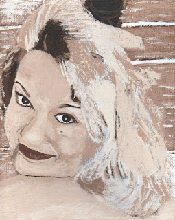
Phyl, this is what I have so far. There's no doubt that the shape is much better than the first one. I still have a lot of work to do on the hair and may go back and redo most of the colors there.
This is harder than it appears, but I intend to get it. Probably will take me the rest of my life.

Good job! It looks like Cindy. Now--let's talk about editing a photo to make a better painting. I know there are a couple of very dark shapes in her hair near her face in the photo. I think they are largely the results of dark roots and the painting would be better off if they were lightened a bit. The principle is this: place your darkest dark and your lightest light in the center of interest (in a portrait that is usually the eyes) and make all of the other areas less dark and less light. Makes the structure of the painting more cohesive. I think the little shadow above her left eye and the large shadow at the top of her face should be lightened. The one at the right side of her face seems to help accentuate her eyes and that pretty curve of her face so I would leave it alone--maybe the other two could be slightly lighter than that one.
ReplyDeleteHad to look at the photo again--trying to figure out what the dark thing is that is growing out of her head. I think you should probably paint it out. And fill in the space in her hair at the back of her head (between the second and third log) and then leave it alone to dry. Once it's dry, you can do a bit more without damaging the structure of the painting. You did good--fun stuff to learn, isn't it?!!
ReplyDelete